Shopping Tiles

Demo
Introduction
This app is my attempt to streamline the process of populating and using a shopping list.
Unlike most other shopping list apps, Shopping Tiles heavily relies on images. This makes adding and removing entries much more visual and quick. You don't need to read, you see the product and immediately know what it is. Also images are more information dense and take up less screen space.
Essentially you have one screen with your favorite products, which you can customize: add/remove, create groups, move products between groups, add your own pictures etc. Highlighting a product sends it to the shopping list screen. Long pressing lets you add it with a text note. You can also create text-only reminders, but as you type them, the app will suggest relevant pictures you might want to use.
Features
- Most interactions only take 1 or 2 clicks
- Shopping list can contain three types of tiles: image, text, and image+text
- Fully customizable page from which user can add products to their shopping list with a single tap
- Built-in gallery with 130+ easy to recognize products
- Ability to add custom images
- Relevant product images are suggested as user types a text entry
- Light and dark modes
- Support for multiple languages
Interface
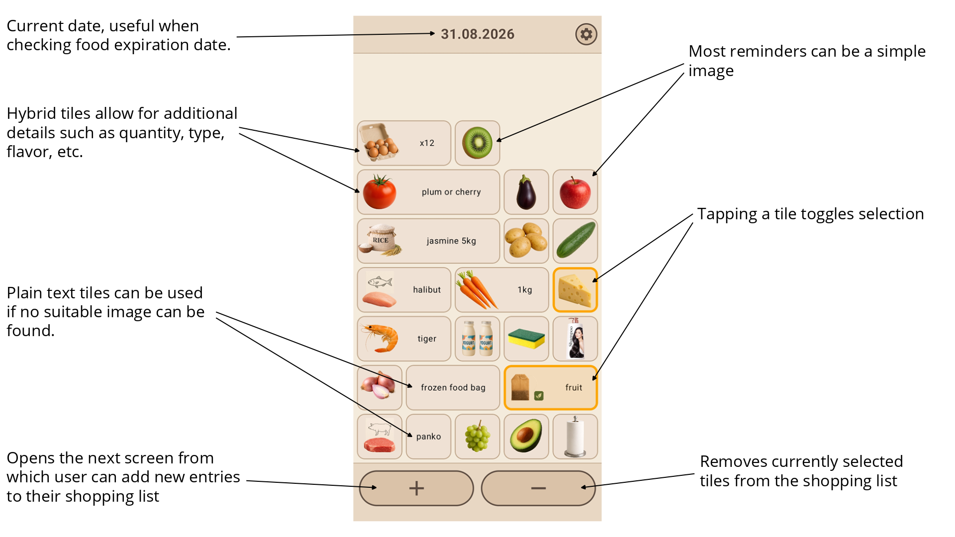
The main screen contains the shopping list. This way the user can see and interact with their shopping list right away when opening the app. Each tile represents one shopping list entry. Tiles are aligned to the bottom of the screen maximize easy reach.
To remove an entry the user first selects one or more tiles and then clicks "minus" button to delete them. I think this system provides a good balance between ease of use and protection from misclicks. Also users are free to decide what selecting a tiles means for them. Some may highlight items they will look for next, while others might highlight things that are already in their basket.
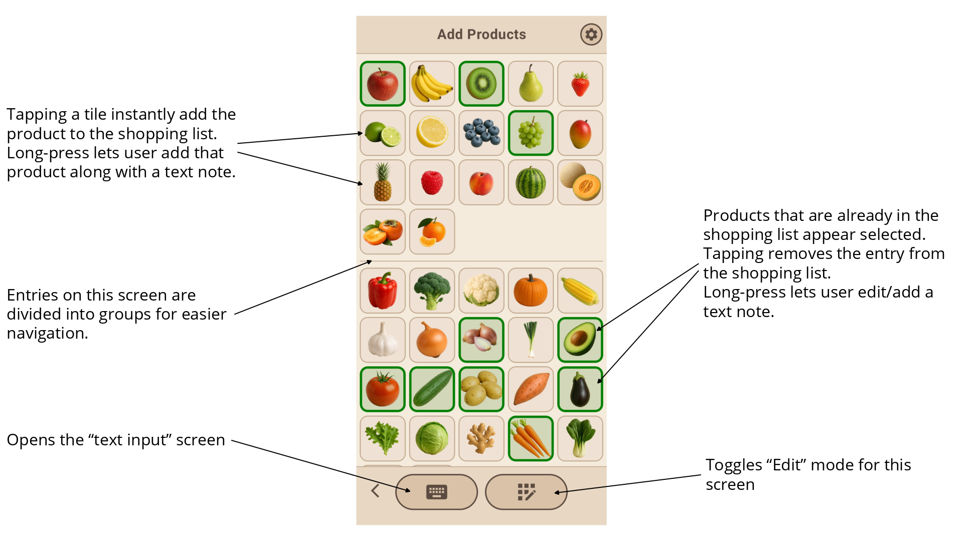
To add new entries to the shopping list the user clicks "plus" button, which opens the next screen. The primary design goal for this screen was to allow for the user to add an entry to their shopping list in as few clicks as possible. In most cases a relevant product image should be there and a single click will add it to the shopping list. Since every user has different shopping habits, this screen must be highly customizable.
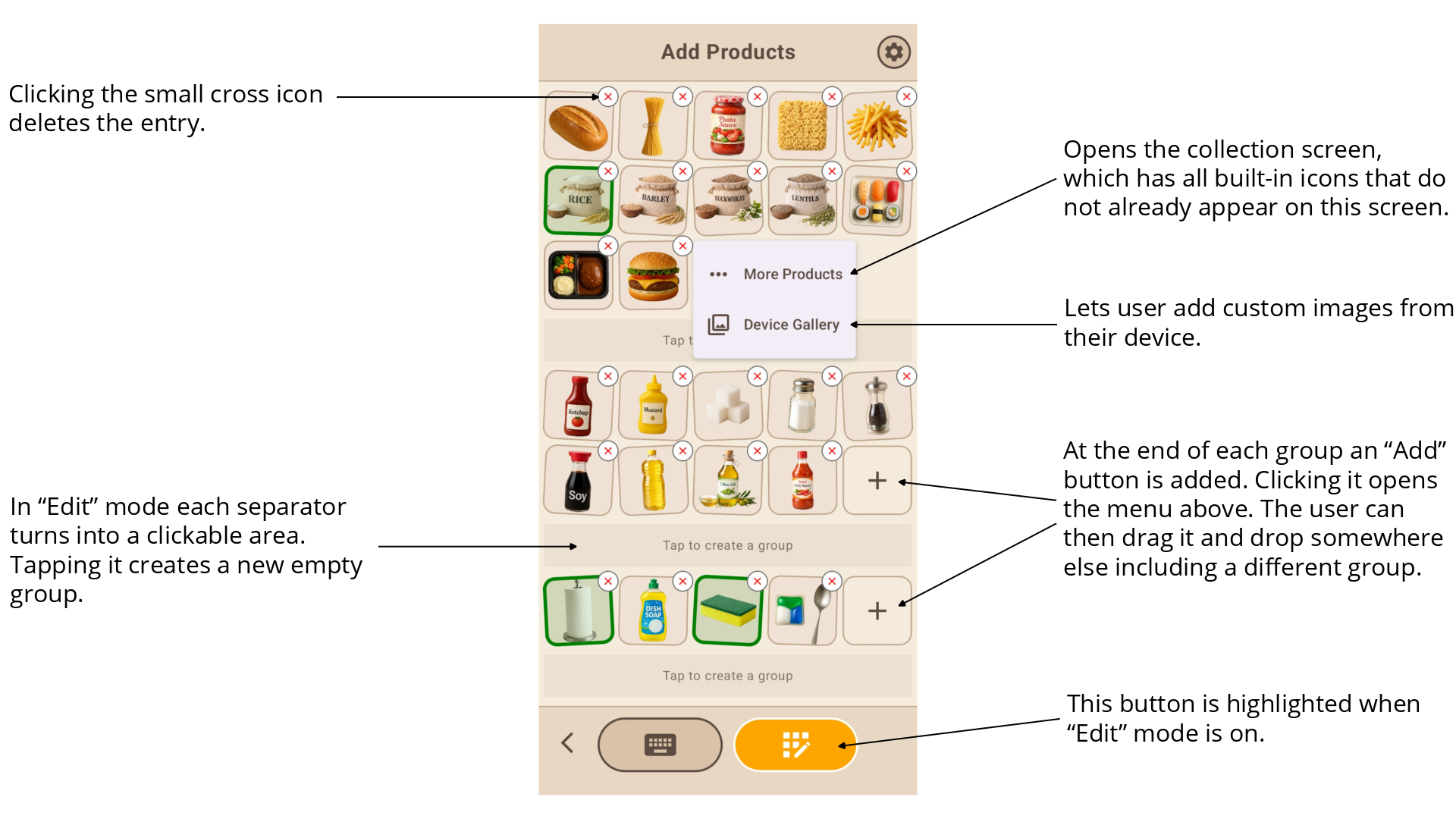
Clicking "Edit" button enables Edit Mode. In this mode tiles become draggable (indicated by subtle rocking, just like the one used when dragging app icons) and group dividers slightly expand to become clickable.
The primary design goal for this screen was to enable all possible customization operations while making them intuitive and easy to use on a phone screen. Any tile can be dragged and dropped anywhere, even in a different group. A tile can be deleted by tapping the small corner icon with the cross. New tiles can be added via the "plus" tile, which provides multiple options. New groups can be added by clicking on areas above and below existing groups. And a group can be removed by leaving it empty and exiting Edit Mode.
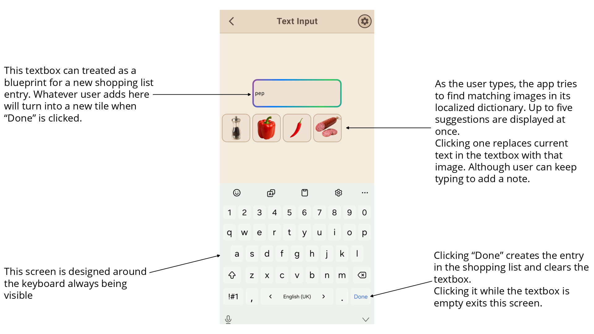
Occasionally the user will be in a situation where no suitable image exists in the app. While ideally they should add a custom image if they need to add this item often, if thats not the case, they can just add a text note. This is done by pressing the keyboard button, which opens the screen below.
This screen is designed around keyboard input. Here the keyboard is not something that just pops up, but an integral part of the screen. As the user types, the app will try to suggest relevant images. The idea here is that the user might not know or forget a certain image exists in the app. One side effect of this system is that this screen can be used as an alternative main method to populate a shopping list quickly. The user just types the first few letters of a product and taps suggested images when thats relevant. Then they click Done, an entry is created, and the screen is ready for further input. This method best suits users who like typing or often use notes and text only reminders.
A variation of this screen is used when the user long-presses a tile.
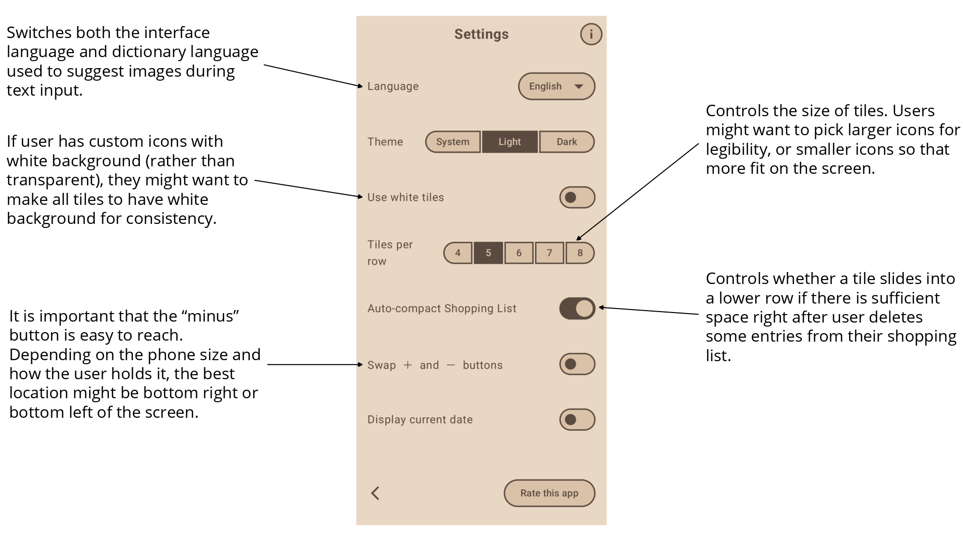
Settings screen can be accessed from anywhere in the app with a single tap. Here the user can adjust the app even further to suit their needs and habits.
Implementation Details
The app was implemented using Kotlin Multiplatform. This allowed me to create both Android and iOS versions simultaneously with a shared codebase and only 0.6% of codebase being written in Swift.
Before committing to implementation I first created a set of sketches in Figma. This allowed me to gather some feedback both related to the product concept and UX.
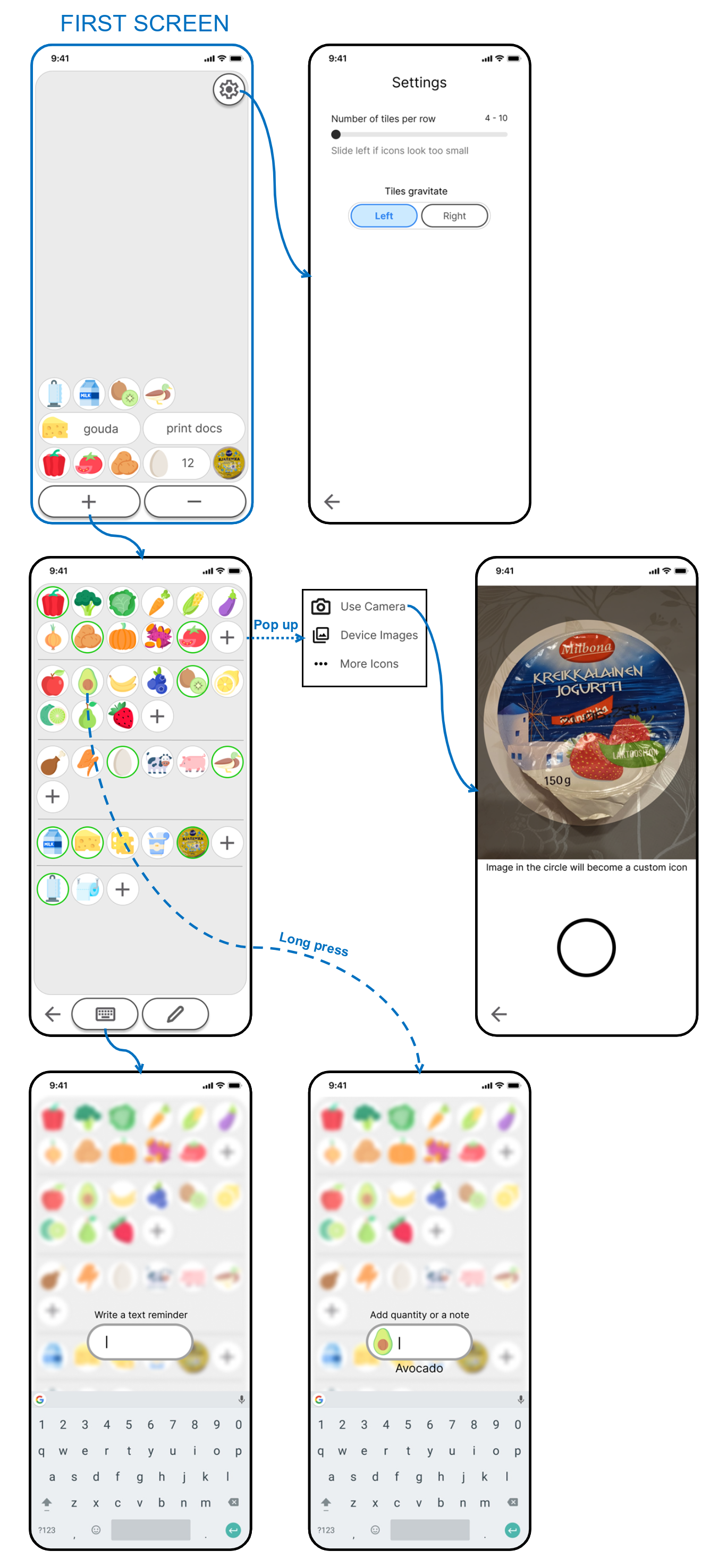
With the help of sketches and feedback several design changes were made. It was decided to make the tiles more rectangular to maximize the use the screen space. And to use realistic AI-generated images rather than icons to maximize legibility and to have more flexibility when communicating various product types. Screen titles were added to make navigation more understandable. And warm sand/beige color scheme was chosen, which was found to fit product images more naturally.